The New UX Patterns of AI: When to Use Chat, When to Use Buttons, and When to Use Both
User experience in the age of AI is evolving beyond the simple chat bubble. Explore when to use pure chat, form-like interfaces, or hybrid patterns to create the most intuitive and effective AI-driven products.
When the AI boom started, every software company in the world seemingly added the same feature: a Chat Bubble in the bottom right corner.
"Ask AI anything!" the buttons promised.
It was a lazy designers' dream. Instead of building complex interfaces, we could just give the user a text box and let them figure it out. But now, in 2026, we’ve learned a painful lesson: Users don't actually want to chat.
Users want a job done. And usually, a flashing cursor in an empty box is the highest-friction way to get that job done.
We are moving away from the "Chat-Only" era and into the era of Intent-Driven Design. Here is how to choose the right UX pattern for your AI features.
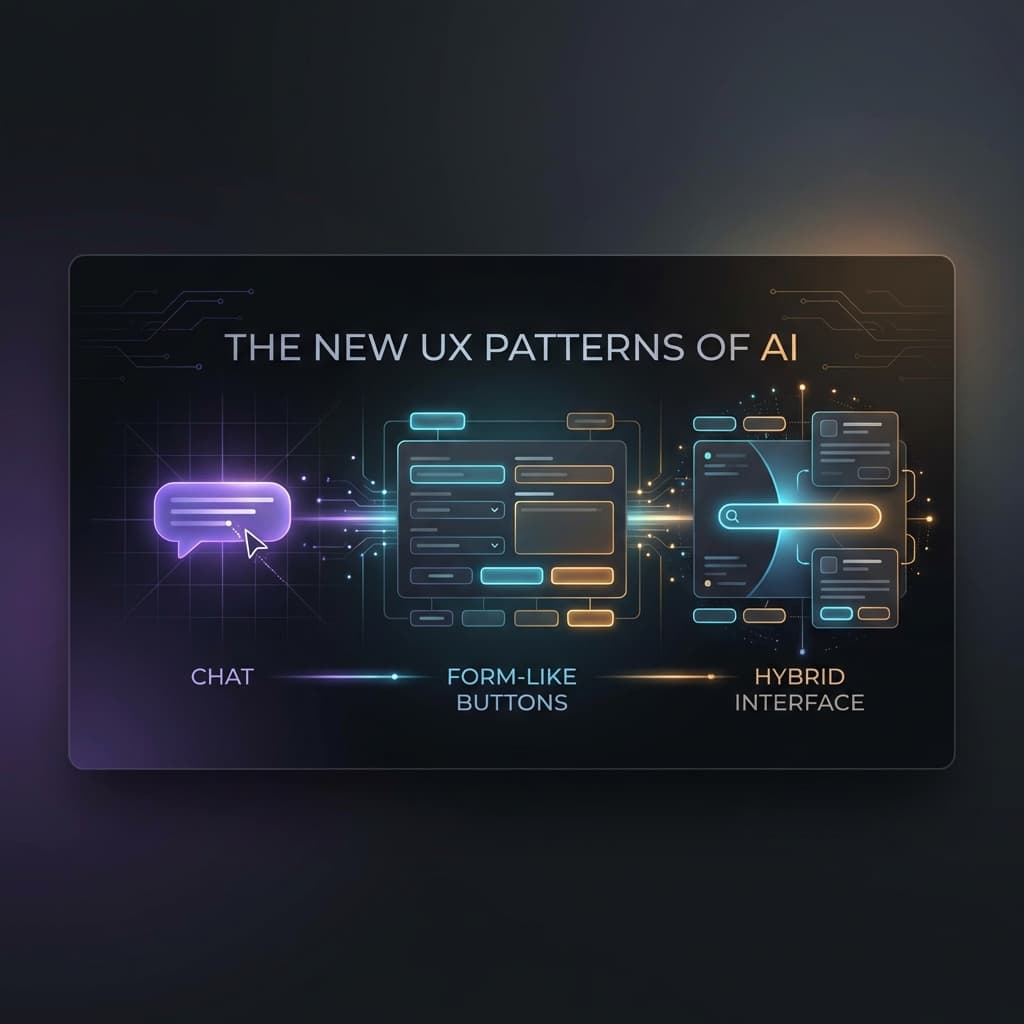
Pattern 1: The Modern Chat (Conversational UI)
When to Use it: When the user has a "High-Entropy" goal—meaning there are a million different ways to say what they want, and a form would be too restrictive.
- The Best Use Case: Creative Brainstorming or Deep Research.
- The UX: A clean, distraction-free text input. But a modern chat is never just a text box.
- Pro Pattern: Suggested Starting Points. ("Ask me to audit this contract for liability" or "Explain the tax implications of...")
- Pro Pattern: Inline Previews. As the AI mentions a document, that document should appear as a clickable card in the sidebar. Don't make the user "scroll back" to find information.
Pattern 2: The "Stealth AI" (The Form-Like UI)
When to Use it: When the task is predictable and the user wants to get in and out as fast as possible.
- The Best Use Case: Data Cleaning, Triage, or One-Click Actions.
- The UX: This doesn't look like AI at all. It looks like traditional software.
- The Pattern: Instead of asking a user, "How should I categorize this expense?", you show them a dropdown where the correct category is already selected by the AI, and there’s a small "AI badge" next to it.
- Why it Wins: It removes the "Blank Page Problem." The user isn't prompting; they are validating.
Pattern 3: The Hybrid (The "Command Palette")
When to Use it: When you have power users who know what they want but don't want to navigate 15 menus to get there.
- The Best Use Case: Internal Tools, CRMs, and IDEs (like Cursor).
- The UX: A command bar (Cmd + K) that accepts both "Fixed Commands" (e.g.,
/deploy) and "Natural Language" (e.g., "Change all the primary buttons to blue"). - The Pattern: Click-to-Refine. The AI generates a draft in a sidebar (the chat), and the human can click a button inside the draft to "Make it Shorter" or "Change Tone."
Case Study 1: The New Search Interface
The Problem: Traditional search gives too many links. Pure chat is too slow for a quick fact-check. The UX Solution:
- The Layout: A central search bar.
- The Result: A single, definitive "Answer Card" at the top (AI-generated). Underneath, a grid of "Source Cards" (traditional links).
- The Action: A set of "Related Question" buttons at the bottom. The Verdict: Users get the answer in 2 seconds (No chat needed), but they can "Double Click" on a source if they want to verify.
Case Study 2: The Modern CRM (Internal Tool)
The Problem: Sales reps hate filling out fields. The UX Solution:
- The Layout: A "Notes" field that is a rich-text editor.
- The AI Twist: As the rep types their notes from a meeting, the AI "Shadow-Fills" the sidebar fields (Deal Size, Close Date, Next Steps).
- The Action: A "Sync" button appears. If the rep clicks it, the fields are updated. The Verdict: The rep does the work they were going to do anyway (taking notes), and the AI handles the "Digital Glue" of the database update.
Case Study 3: The Customer Service App
The Problem: Chatbots are frustrating. The UX Solution:
- The Layout: A "Selection-First" interface.
- The AI Twist: The user clicks "Issue with my order." The AI then presents 3 buttons: "Where is it?", "It’s broken," "Refunding."
- The Action: Only after the user selects a button does the chat open to gather specific details. The Verdict: By using buttons as "Intent Gates," you prevent 90% of the "I didn't understand that" errors.
The Golden Rule of AI UX: "Show, Don't Tell; Draft, Don't Ask"
If you can replace a text prompt with a button, do it. If you can replace a blank box with a "Suggested Draft," do it.
The goal of AI UX is to reduce the Cognitive Load on the user. We used to spend our time building "Navigation." Now we spend our time building "Frictionless Paths."
Your AI UX Checklist:
- Can this task be completed with buttons instead of a chat?
- Are there "Suggested Prompts" to help the user get started?
- Is the AI’s work clearly labeled so the user knows where the "Magic" is happening?
- Can the user "Undo" or "Edit" the AI’s output easily?
- Does the interface change dynamically based on the AI’s confidence level?
The chat bubble was just the beginning. The future of software is an interface that changes to match your intent.